When a website loads slowly, is impossible to navigate, or demands an instruction manual to complete a simple task, you don't just feel frustrated; you feel let down. That immediate sense of disappointment, or delight, is the essence of Website User Experience (UX). It's not just about pretty pictures or cool animations; it’s about how your audience feels when they interact with your digital presence, and whether their journey is smooth, intuitive, and ultimately, successful.
In today's competitive online landscape, a superior website UX isn't a luxury—it's a fundamental requirement. It’s the invisible hand guiding your users, building trust, and turning casual visitors into loyal customers.
At a Glance: Your Website UX Essentials
- UX is more than just UI: User Experience (UX) is the entire journey and feeling a user has, while User Interface (UI) is the visual and interactive elements they see and touch.
- It's a business imperative: Good UX boosts conversions, fosters retention, and elevates your brand's perception. Bad UX drives users away—88% of users abandon a product after a poor experience.
- Think like your user: Understand their goals, pain points, and natural behaviors. Design to meet their needs, not just your own.
- Prioritize speed and mobile-first: Quick loading times and seamless mobile responsiveness are non-negotiable for modern users and search engines.
- Clarity above all: Intuitive navigation, clear microcopy, and strategic use of white space prevent confusion and guide users effortlessly.
- It's an ongoing process: UX isn't a one-and-done project. It requires continuous research, testing, and iteration.
What is Website UX, Really? Crafting Delight, Not Just Code
At its core, User Experience (UX) describes the entire emotional and functional journey an end-user undertakes when interacting with a product or service. For a website, this isn't limited to what you see; it’s how effortlessly you find information, how quickly a page loads, how simple it is to complete a form, or how secure you feel entering personal data. Coined by Don Norman, UX encompasses "everything that touches upon your experience with the product."
Think of it this way: a great UX is often invisible. You don't notice it because it seamlessly helps you accomplish your tasks without any friction or distraction from the interface itself. When you do notice the UX, it's usually because it's frustrating, inefficient, or confusing.
UX vs. UI: Beyond the Pixels
It’s easy to confuse Website UX with UI (User Interface), but they are distinct concepts that work hand-in-hand.
- User Interface (UI): This is what users see and touch. It's the visual and interactive elements—the layouts, colors, typography, buttons, icons, and visual feedback you get when you click something. UI designers focus on the aesthetics and interactivity of individual screens and components. A product can have a stunning UI and still deliver poor UX if it's confusing, difficult to use, or doesn't meet user needs.
- User Experience (UX): This is the entire system of interactions, feelings, and perceptions a user has with your product or service over time. UX designers conduct research, identify user needs, map out user flows, and create prototypes. They design the journey and the feelings, ensuring the product is useful, usable, desirable, findable, accessible, and credible. As Jeff Johnson wisely puts it, "One cannot design a user experience, only design for a user experience."
Ultimately, UI is a crucial part of UX, but UX encompasses the complete experience design process, shaping how users interact with, understand, and feel about a product in its entirety.
Why Good UX is Your Business's Secret Weapon for Growth
Investing in superior Website User Experience isn't just a nicety; it's a strategic business imperative that pays dividends. A well-designed, usable, attractive, and fast-loading website is no longer optional—it's what users expect and what drives business success in the digital age.
The Tangible Returns of Stellar UX
- Boosts Customer Retention and Loyalty: When users have a positive experience, they're more likely to return. Easy navigation, clear information, and efficient task completion foster loyalty, turning one-time visitors into repeat customers.
- Increases Sales and Conversions: A frictionless user journey makes it easier for visitors to find what they need, understand your offerings, and complete desired actions—whether that's making a purchase, signing up for a newsletter, or requesting a demo. Intuitive online purchase paths directly benefit your bottom line.
- Enhances Brand Perception: A high-quality UX associates your brand with professionalism, technological sophistication, ease of use, and a deep commitment to customer satisfaction. It signals that you value your customers' time and needs.
- Improves Search Engine Optimization (SEO): Websites with good UX naturally exhibit characteristics that search engines favor, such as fast page speeds, low bounce rates, and mobile responsiveness. This translates to better visibility and organic traffic.
- Reduces Customer Support Costs: Clear information, intuitive self-service options, and effective error prevention minimize user frustration and the need for direct support interventions, saving your business time and resources.
- Supports Overall Customer Experience (CX): Website UX is a key component of the broader Customer Experience (CX). A strong online experience complements and strengthens all other customer touchpoints.
At its heart, effective UX design requires a deep understanding of customer goals, priorities, and needs. By putting yourself in your customer's shoes, you can align your website’s design with other business objectives like market segmentation, personalization, and persona development, creating a truly impactful online presence.
The Blueprint: How UX Comes Together with Garrett's Five Elements
To understand how a great user experience is constructed, it helps to look at Jesse James Garrett’s "Five Elements of User Experience." This framework illustrates how UX is built layer by layer, moving from abstract concepts to concrete details. Think of it as the architectural plan for your website, ensuring every decision contributes to a cohesive and user-centric experience.
- Strategy (The Foundation): This is the most abstract layer, focusing on why you're building the website and who it's for.
- User Needs: What do your users want to achieve? What are their pain points?
- Business Goals: What are your company’s objectives for the website? How does it align with your overall mission?
- Example: A strategy might be to help small businesses easily find and purchase eco-friendly office supplies, while also increasing your brand's market share in sustainable products.
- Scope (Defining the "What"): Once you have a strategy, you translate those needs and goals into specific features and content.
- Functional Specifications: What specific functionalities will the website have (e.g., search, shopping cart, user accounts, product filters)?
- Content Requirements: What information and types of content are needed (e.g., product descriptions, blog posts, FAQs, videos)?
- Example: Based on the strategy, the scope might include a "quick order" feature, detailed product spec sheets, and customer testimonials.
- Structure (The Architecture): This layer organizes information and defines how the product works. It's the blueprint for user flows and information architecture.
- Information Architecture (IA): How is the content organized and labeled to make it findable? (e.g., categories, subcategories, navigation menus).
- Interaction Design (IxD): How do users interact with the system to accomplish tasks? What are the steps in a process? (e.g., checkout flow, account creation wizard).
- Example: Structuring the eco-friendly supplies website would involve clear categories like "Recycled Paper," "Sustainable Cleaning," and an intuitive checkout process.
- Skeleton (The Tangible Layout): This is where you lay out the initial interfaces, navigation, and visual design elements.
- Interface Design: The specific arrangement of interface elements (buttons, forms, images) on a page.
- Navigation Design: How users move through the website (e.g., global navigation, local navigation, breadcrumbs).
- Information Design: How information is presented to be easily digestible and understandable.
- Example: Wireframes and mockups are created here, showing where the search bar, product images, and "Add to Cart" button will be placed on a product page.
- Surface (The Visual Polish): The most concrete layer, this is the visual design and all the sensory details users see and interact with.
- Visual Design: Colors, typography, imagery, branding—the aesthetic appeal that gives the website its look and feel.
- Example: Applying brand-specific green and earthy tones, using clean, readable fonts, and high-quality product photography to enhance the sustainable image.
These elements don't just happen in a linear fashion; they are iterative and interconnected. A strong foundation in strategy and scope ensures that the structure, skeleton, and surface effectively serve both user needs and business goals.
Principles of Flawless UX: Jakob Nielsen's 10 Usability Heuristics
To ensure your website delivers a truly user-friendly experience, adhering to established usability principles is key. Jakob Nielsen, a renowned UX expert, articulated ten "heuristics" or rules of thumb for good interface design. These aren't rigid laws, but powerful guidelines to assess and improve the usability of any interface.
- Visibility of System Status: Always keep users informed about what’s happening, through appropriate feedback within a reasonable time. Think loading indicators, progress bars, or confirmation messages. Users shouldn't be left guessing.
- Match Between System and Real World: Speak your users' language, not technical jargon. Use concepts, words, and images familiar to your audience, following real-world conventions. Make it feel intuitive and natural.
- User Control and Freedom: Give users a sense of agency. They should easily be able to undo actions, exit processes, or correct mistakes without penalty. Think "undo" buttons, clear "cancel" options, or breadcrumbs for navigation.
- Consistency and Standards: Maintain consistency across your website and adhere to industry conventions. Similar elements should look and behave similarly. Don't reinvent the wheel for common interactions (e.g., a search icon).
- Error Prevention: The best error message is no error message at all. Design your website to prevent errors from occurring in the first place through good design, constraints, and helpful prompts. If an error is unavoidable, anticipate it.
- Recognition Rather Than Recall: Minimize the user's memory load by making elements, actions, and options visible. Don't make users remember information from one part of the site to use in another. Provide clear labels and context.
- Flexibility and Efficiency of Use: Cater to both novice and expert users. Offer shortcuts or accelerators for frequent actions, but also provide clear, guided paths for new users.
- Aesthetic and Minimalist Design: Keep your interface clean and uncluttered. Focus on essentials; every extra piece of information or visual element competes for attention and can distract users from their goals.
- Help Users Recognize, Diagnose, and Recover from Errors: When errors do occur, provide clear, concise, and plain-language explanations of the problem, and offer constructive solutions for how to fix it. Avoid obscure error codes.
- Help and Documentation: While an intuitive site shouldn't need extensive help, it should be available. Make help content easy to find, task-focused, concise, and relevant to the user's current context.
By keeping these heuristics in mind, you can systematically evaluate and refine your website to deliver a truly excellent user experience.
Spotting UX Excellence: Real-World Examples
Sometimes, the best way to understand good UX is to see it in action. These websites exemplify how thoughtful design translates into delightful and efficient user experiences:
- Apple Product Pages: Step onto an Apple product page, and you’re immersed. They combine interactive, moving imagery with balanced, digestible written information. Visually arresting transitions guide you through features, making complex technology feel accessible and desirable. Crucially, this rich experience works perfectly and fluidly on mobile devices, showcasing a commitment to responsive design.
- Google.com: The quintessential example of minimalism as a UX strength. Google's front page consistently resists clutter, featuring little more than a search bar and a few buttons. This single-minded focus makes it inherently user-friendly, instantly communicating its core purpose without distraction.
- WeTransfer: This file transfer service offers a masterclass in frictionless design. Its process is fast, simple, and intuitive, working flawlessly across devices. By using an array of backdrop wallpapers without unnecessary bloat, WeTransfer maintains a visually appealing, yet functional experience that prioritizes the user's task.
These examples share common threads: they prioritize clarity, ease of use, speed, and a deep understanding of what their users want to accomplish.
Quick Wins: Boosting Your Website's UX Today
You don't need a complete overhaul to start improving your website's UX. Here are some immediate, high-impact changes you can implement:
1. Prioritize Fast Page Speed
Nothing frustrates users—or search engines—more than a slow website. A quick loading site not only prevents users from abandoning your page but also boosts your SEO, driving more traffic.
- How-to: Optimize images, leverage browser caching, minify CSS/JavaScript, and use a Content Delivery Network (CDN). Regularly test your speed with tools like Google PageSpeed Insights.
2. Ensure Mobile Responsiveness
With mobile devices accounting for over half of all web traffic, your website must perform equally well on desktops, tablets, and phones, across all major browsers. Adopt a mobile-first design approach, meaning you design for the smallest screen first, then scale up.
- How-to: Use responsive design frameworks, test on various devices and emulators, and prioritize touch-friendly elements.
3. Design Clear, Intuitive Navigation
Users should never have to think about where to go next. Your navigation should reflect common user tasks and use language that matches their vocabulary.
- How-to: Keep navigation menus concise, use clear and descriptive labels, consider breadcrumbs for deeper pages, and conduct user testing to validate your navigation structure.
4. Optimize Landing Pages for Impact
Your landing pages are often a user's first impression. Ensure they are designed around user needs, make a strong first impression, and provide an easy onward journey into the relevant parts of your site.
- How-to: Keep your primary call-to-action (CTA) prominent, reduce clutter, ensure headlines clearly communicate value, and match page content to the referring ad or link.
5. Use Effective Microcopy
Microcopy is the small, functional text on your website—button labels, calls to action, form instructions, error messages, and tooltips. Well-crafted microcopy informs, reassures, explains, and guides users.
- How-to: Be concise, direct, helpful, and use a consistent brand voice. For example, instead of "Submit," use "Get Your Free Ebook" or "Request a Demo."
6. Embrace White Space
Empty space between page elements is not wasted space; it’s crucial for readability and comprehension. White space prevents information overload, creates visual hierarchy, and makes your content feel less intimidating.
- How-to: Use ample line spacing, generous margins, and padding around elements. Let your content breathe.
7. Format Hyperlinks Clearly
Links are gateways. They should be visually distinct (e.g., different color, underline) and their anchor text should be unique and informative, giving users a clear expectation of where they'll go.
- How-to: Avoid generic phrases like "click here." Instead, use descriptive text that explains the link's destination, such as "read our full privacy policy" or "explore product features."
Debunking UX Myths: What You Think You Know Might Be Wrong
The world of UX is rife with assumptions that, while well-intentioned, can lead to suboptimal design decisions. Let's bust some common myths:
Myth 1: The 7±2 Rule (Limit Navigation Items to Seven)
This popular "rule" misapplies George Miller's 1956 theory on short-term memory capacity. Users don't need to recall navigation items that are visually present on a page. Modern interfaces with clear labels and organization can comfortably present more than seven items without overwhelming users.
- Reality: Focus on clear information architecture and logical grouping, not an arbitrary number. Users can process more if it's well-structured.
Myth 2: Users Don't Scroll
For years, designers were told to put everything "above the fold." Chartbeat data, however, shows that 90% of users scroll within 14 seconds.
- Reality: Users will scroll if the UX is well-designed, providing clear structure, labeled content, and visual signals of value further down the page. What matters is compelling content and clear signposting, not forced brevity.
Myth 3: Fewer Clicks, Longer Time on Page (The 3-Click Rule)
The idea that users will abandon a task if it takes more than three clicks is an oversimplification. Task complexity varies wildly, and not all clicks are equal (an instantaneous click within the same page is different from one that loads a new page).
- Reality: Focus on clear information architecture, easy wayfinding, and consistent interaction design. A task that takes five clear, easy clicks with good feedback is far better than two confusing, frustrating clicks. User effort and mental load are more important than a raw click count.
Myth 4: Simple = Minimal
While minimalism can be elegant, it often gets misinterpreted as simply removing elements. Overvaluing minimalism at the cost of clarity can lead to dysfunctional experiences.
- Reality: Good UX is about clarity and efficiency, not just aesthetic sparseness. Icons without text labels, non-standard elements without contextual guidance, or hidden navigation can confuse users. Smart simplicity guides users to smart choices; it doesn't leave them guessing.
Myth 5: Data Solves Everything
Data (analytics, A/B tests) is invaluable, but relying on it too early or exclusively can limit creative solution exploration and introduce bias, confirming existing assumptions rather than discovering novel approaches.
- Reality: Data should supplement, not replace, qualitative user research (interviews, usability testing) and a deep human understanding of behavior and motivations. It tells you what is happening, but user research explains why.
By letting go of these outdated beliefs, you can approach UX design with a more open and effective mindset.
The UX Design Process: A Roadmap for Continuous Improvement
Great UX isn't accidental; it’s the result of a structured, iterative process centered around understanding and empathizing with users. Think of it as a continuous cycle of discovery, creation, and refinement.
1. User Research: Understanding Your Audience Deeply
This foundational step is all about getting to know your users: their goals, pain points, motivations, and behaviors. Without this understanding, you're just guessing.
- Methods:
- Surveys & Interviews: Direct conversations or questionnaires to gather qualitative insights.
- Observation: Watching users interact with existing products or performing related tasks.
- User Personas: Creating fictional, yet data-driven, representations of your ideal users.
- Empathy Maps: Visualizing user attitudes, behaviors, and emotions.
- Contextual Feedback: For live products, in-app surveys or Net Promoter Score (NPS) can provide valuable insights.
2. Solution Ideation: Brainstorming Creative Answers
Based on your research data, this phase involves generating a wide array of potential solutions to address the identified user needs and business goals.
- Methods:
- Design Workshops: Collaborative sessions to generate ideas.
- Mind Mapping: Visually organizing thoughts and concepts.
- SWOT Analysis: Evaluating strengths, weaknesses, opportunities, and threats of potential solutions.
- User Flow Diagrams: Mapping out the steps a user takes to complete a task.
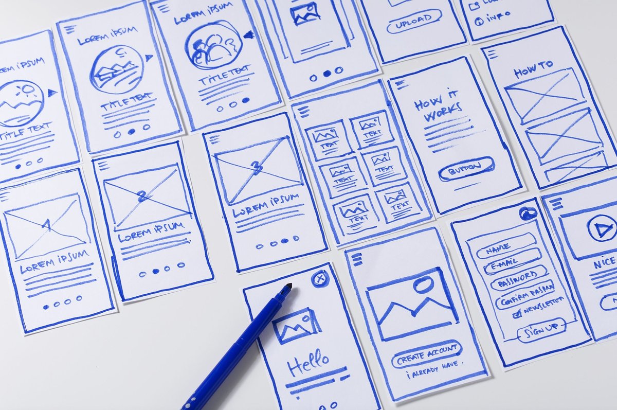
3. Prototype and Testing: Building and Validating Ideas
This step brings your ideas to life in a tangible, albeit often low-fidelity, form and puts them in front of real users to gather feedback.
- Methods:
- Wireframes: Basic visual guides showing page structure and element placement.
- Mockups: More detailed visual designs with colors, typography, and imagery.
- Interactive Prototypes: Clickable models that simulate the website's functionality.
- Usability Testing: Observing real users performing tasks with your prototypes (moderated or unmoderated).
- Think-Aloud Protocols: Asking users to voice their thoughts as they navigate.
- A/B Testing: Comparing two versions of a design element to see which performs better with live users.
4. Iteration and Revision: The Cycle of Refinement
UX is never truly "done." This phase involves analyzing testing feedback and making informed revisions to your designs. It’s an ongoing cycle of improvement.
- Methods:
- Analyze Feedback: Systematically review qualitative and quantitative data from testing.
- Refine Designs: Incorporate changes to address pain points and improve usability.
- Track Metrics: Monitor key performance indicators (KPIs) like feature adoption, user engagement, and retention to measure the effectiveness of your changes.
This iterative process ensures that your website continuously evolves to meet changing user needs and business objectives, leading to a consistently improving experience. You can learn more about this continuous feedback loop and its impact by exploring perspectives like those offered by experts like Sandra Cho.
Measuring Success: How to Assess Your Website's UX
Unlike a single sales figure, Website UX can't be tracked by one numerical metric. Instead, its quality is assessed through a strategic blend of indirect measurements and invaluable qualitative user feedback. This mixed-methods approach helps paint a holistic picture of your website’s performance from a user perspective.
Quantitative Metrics (The "What"):
These tell you what is happening on your site.
- Conversion Rates: How many users complete a desired action (e.g., purchase, sign-up, download)? An increase suggests improved UX.
- Page Loading Speeds: Crucial for user satisfaction and SEO. Tools like Google PageSpeed Insights provide objective data.
- Bounce Rate: The percentage of visitors who leave your site after viewing only one page. A high bounce rate can indicate poor first impressions or irrelevant content.
- Time on Page/Site: How long users spend engaging with your content. Longer times can suggest higher engagement, though context is key.
- Task Completion Rate & Time: For specific tasks (e.g., filling a form, completing a checkout), measure how many users succeed and how long it takes them.
- Error Rates: Track how often users encounter errors (e.g., broken links, form validation errors).
Qualitative Feedback (The "Why"):
This is where you understand why users behave the way they do and how they feel.
- User Testing: Observing real users interacting with your site or prototypes, often with "think-aloud" protocols. This reveals pain points and unexpected behaviors.
- Website Surveys: On-site pop-ups or dedicated survey pages asking users about their goals, satisfaction, and challenges.
- User Reviews & Social Media: Monitoring public sentiment and direct feedback across various platforms.
- Customer Support Logs: Identifying recurring issues or questions that indicate areas of confusion on your website.
Integrating qualitative and quantitative data can be challenging but is essential for identifying true pain points and drawing actionable conclusions. Robust UX research platforms (like Qualtrics Strategic UX platform, as noted in research) can help gather data, identify trends, and provide insights that drive meaningful improvements. Remember, understanding user goals and how well your site supports them is the ultimate measure of UX success.
Beyond the Basics: UX in the SaaS World & In-App Guidance
While the core principles of Website UX apply universally, the context of Software as a Service (SaaS) presents unique considerations. In SaaS, UX shifts from individual pages to creating a holistic, continuous system that fosters trust, encourages adoption, and drives long-term retention.
For SaaS, UX isn't just about the interface within the application itself. It encompasses every user interaction throughout their lifecycle:
- Pre-login Experience: Clear pricing, easy sign-up, informative marketing pages.
- Onboarding: Welcoming emails, guided product tours, initial setup flows.
- In-App Interactions: Performance, responsiveness, error messages, ease of task completion.
- Support & Documentation: Help centers, chatbots, customer service interactions.
- Beyond the App: Renewal emails, community forums, confidence in explaining the product to others.
The goal here is to reduce friction across the entire user lifecycle, enabling users to focus on the outcomes the product helps them achieve, rather than the mechanics of using it. This is driven by deep empathy and continuous user research.
Leveraging In-App Guidance for Enhanced UX
A critical component of effective SaaS UX—and a powerful way to apply UX basics—is well-designed in-app guidance. This guidance can significantly support the user journey from the moment they log in or sign up, especially for complex products or new features.
Examples of effective in-app guidance that enhance UX:
- Product Tours: Step-by-step guides for new users to quickly grasp core functionalities.
- Tooltips: Brief, contextual explanations that appear when users hover over or click on an unfamiliar feature.
- Onboarding Checklists: Interactive lists that guide users through key activation milestones, providing a sense of progress.
- Announcement Modals: Timely pop-ups to inform users about new features or important updates.
These interactive elements, when thoughtfully designed, reduce the learning curve, prevent frustration, and help users discover the full value of your product. Tools like UserGuiding, for instance, empower non-technical teams to create these elements without requiring developer resources or coding, making UX improvement more accessible.
Your Next Steps: Building a UX-Minded Culture
You've now got a solid understanding of what Website User Experience is, why it's critical, and how to start improving it. The journey to exceptional UX is not a destination, but a continuous commitment.
To truly excel, consider these actionable next steps:
- Start with Empathy: Before touching any design tools, invest time in understanding your users. Conduct quick surveys, interview a few customers, or simply observe how people interact with your existing site or similar ones. What are their goals? What frustrates them?
- Focus on Quick Wins: Implement a few of the "quick wins" discussed earlier. Improving page speed, ensuring mobile responsiveness, or clarifying your navigation can yield immediate positive results.
- Test, Test, Test: Even small changes benefit from testing. Ask a friend, colleague, or a few actual users to try out a specific task on your website. Observe them. Their feedback is invaluable.
- Embrace Iteration: Understand that your website's UX will always evolve. Treat every improvement as an experiment, learn from the results, and refine your approach.
- Cultivate a UX Mindset: Encourage everyone on your team—from content creators to developers to marketing specialists—to think about the user's experience in their respective roles. A holistic approach yields the best results.
- Keep Learning: The field of UX is dynamic. Stay curious, read industry blogs, and follow experts. Understanding foundational principles like usability heuristics will serve you well, but continuous learning is key to staying ahead.
By putting users at the heart of your website development and maintenance efforts, you won't just build a better website; you'll build stronger connections with your audience, drive sustained engagement, and ultimately, achieve greater online success.